# PDF Customization with Custom CSS
Folge uses HTML and CSS to generate PDF documents. It builds an HTML document, applies internal CSS styles, and converts it to PDF. You can inject your own CSS to customize the final output — change fonts, colors, spacing, backgrounds, and more.
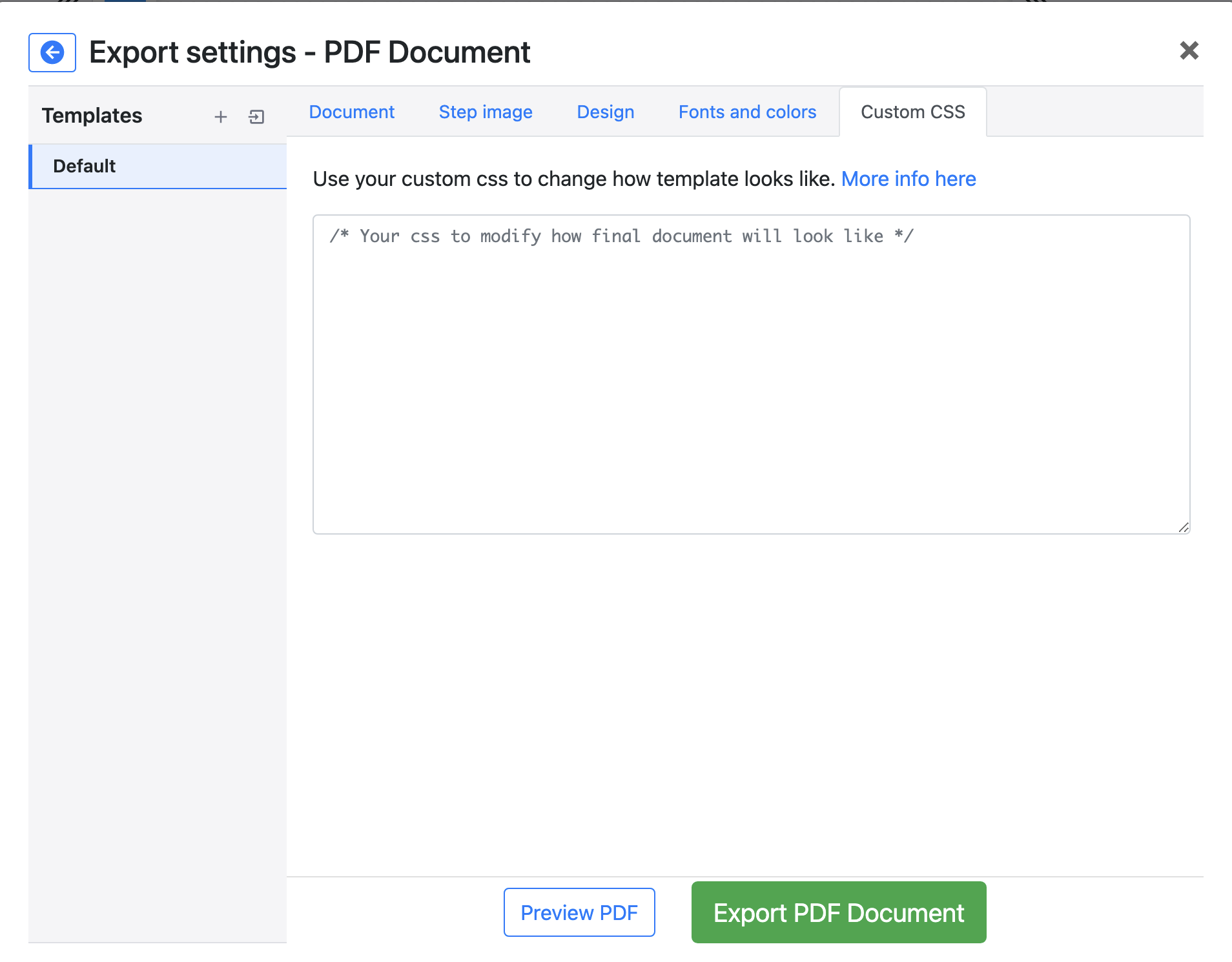
# Custom CSS location
Open any guide, click Export → PDF Document, then find the Custom CSS field in the export settings.
Paste your CSS there. It will be injected after all built-in styles, so your rules take precedence.
# HTML Structure
# Document overview
The PDF is built from multiple <section> tags, each representing a page:
<body>
  <section class="sheet coverPage">
    <!-- Cover page -->
  </section>

  <section class="sheet tocPage">
    <!-- Table of contents -->
  </section>

  <section class="sheet stepsPage">
    <!-- Steps (one or more per page depending on layout) -->
  </section>

  <!-- More stepsPage sections as needed -->
</body>
Sections may also have a landscape class when landscape orientation is selected.
# Cover page
The cover page is optional — it can be toggled in PDF Export Settings. It shows the guide title and description:
<section class="sheet coverPage">
  <div class="guideDetailsWrapper">
    <h2 class="title"><!-- Guide title --></h2>
    <div class="description">
      <!-- Guide description (rich text) -->
    </div>
  </div>
</section>
# Table of contents
Also optional. Controlled in PDF Export Settings.
<section class="sheet tocPage">
  <div class="header"><!-- Header --></div>
  <div class="tocWrapper">
    <h3 class="tocTitle"><!-- Table of contents title --></h3>

    <div class="tocItem">
      <a href="#step-0" class="link"><!-- Step title --></a>
      <span class="tocItemPageNumber"><!-- Page number --></span>
    </div>

    <div class="tocItem nested-1">
      <!-- Substep (level 1 nesting) -->
      <a href="#step-1" class="link"><!-- Substep title --></a>
      <span class="tocItemPageNumber"><!-- Page number --></span>
    </div>

    <!-- More tocItems... -->
  </div>
  <div class="footer"><!-- Footer --></div>
</section>
Substeps get a nested-N class where N indicates the nesting depth (nested-1 for 2.1, nested-2 for 2.1.1, etc.).
# Step page — standard layout
Each step page has a header, content area, and footer. The header and footer are optional.
<section class="sheet stepsPage">
  <div class="header"><!-- Header --></div>

  <div class="stepPageContent">
    <div class="stepTitle">
      <div class="stepTitleIndex"><!-- Step number badge --></div>
      <div class="stepTitleText"><!-- Step title --></div>
    </div>
    <div class="stepDescription"><!-- Step description (rich text) --></div>
    <div class="stepImage">
      <img src="...">
    </div>
  </div>

  <div class="footer"><!-- Footer --></div>
</section>
Substeps have additional classes on both .stepTitle and .stepDescription:
<div class="stepTitle subStep subStep-1">
  <!-- subStep-1 = first nesting level (e.g. 2.1) -->
  <!-- subStep-2 = second level (e.g. 2.1.1) -->
</div>
<div class="stepDescription subStep subStep-1"><!-- ... --></div>
# Content blocks
A content block is a special kind of step that has no screenshot and no step number — it acts as a section divider or heading inside the guide. In the generated HTML it replaces the regular .stepTitle / .stepImage markup with a single .contentBlockTitle element (the description, if any, still renders below it as .stepDescription):
<section class="sheet stepsPage">
  <div class="header"><!-- Header --></div>

  <div class="stepPageContent">
    <div class="contentBlockTitle"><!-- Content block title --></div>
    <div class="stepDescription"><!-- Rich text description --></div>
  </div>

  <div class="footer"><!-- Footer --></div>
</section>
Content blocks inherit the step title font and color settings by default. In Table layout, a content block becomes a full-width row with no image column:
<div class="step-table-row step-table-row-noimage">
  <div class="step-table-col step-table-col-text step-table-col-text-full">
    <div class="contentBlockTitle"><!-- Content block title --></div>
    <div class="stepDescription"><!-- Description --></div>
  </div>
</div>
# Step page — table layout
When Table layout is selected, steps use a two-column table structure:
<div class="step-table-row step-table-row-first">
  <div class="step-table-col-image">
    <img src="...">
  </div>
  <div class="step-table-col-text">
    <span class="step-table-badge"><!-- Step number --></span>
    <span class="step-table-title"><!-- Step title --></span>
    <div class="stepDescription"><!-- Step description --></div>
  </div>
</div>
Additional row classes:
step-table-row-first— the first row of a step (image + text)step-table-row-cont— continuation row (description overflow)step-table-row-noimage— full-width text row (no image column, or content block)
The image column side can be flipped via the Table image position setting, so don't assume image is always on the left.
# Header and footer
Header and footer each have a 3-column layout. Logo placement (left, center, or right) determines column arrangement.
<div class="header">
<div class="columns">
<div class="column col-1"> </div>
<div class="column col-9 text-center">
<div class="headerText"><!-- Header text --></div>
</div>
<div class="column col-2 text-right">
<img class="headerLogo img-responsive" src="">
</div>
</div>
</div>
<div class="footer">
<div class="columns">
<div class="column col-2 text-left">
<img class="footerLogo img-responsive" src="">
</div>
<div class="column col-8 text-center">
<div class="footerText"><!-- Footer text --></div>
</div>
<div class="column col-2 text-right">
<div class="footerNumbering"><!-- Page number --></div>
</div>
</div>
</div>
# Text blocks
Text blocks can be positioned before or after titles, descriptions, and images. Each has a type: alert, info, warning, or success.
<div class="stepTextBlock warning">
  <div class="stepTextBlockIcon">
    <!-- SVG icon for the block type -->
  </div>
  <div class="stepTextBlockContent">
    <div class="stepTextBlockTitle"><!-- Block title --></div>
    <div class="stepTextBlockDescription"><!-- Block content --></div>
  </div>
</div>
# Multi-image substeps
Steps that contain multiple images produce repeated blocks inside .stepPageContent, one per sub-image:
<div class="multiImageSubstepTitle"><!-- Substep title --></div>
<div class="multiImageSubstepDescription"><!-- Substep description --></div>
<div class="stepImage"><img src="..."></div>
The order of title / description / image is controlled by the step's block settings.
# CSS Examples
Here are some practical examples to get you started.
# Change step title color and size
.stepTitleText {
  color: #2c3e50;
  font-size: 22px;
}
# Hide step number badges
.stepTitleIndex {
  display: none;
}
# Add a border around step images
.stepImage img {
  border: 2px solid #e0e0e0;
  border-radius: 4px;
}
# Change cover page background
.coverPage {
  background-color: #1a1a2e;
}
.coverPage .title {
  color: #ffffff;
}
# Indent substeps in table of contents
.tocItem.nested-1 { padding-left: 20px; }
.tocItem.nested-2 { padding-left: 40px; }
# Style text blocks by type
.stepTextBlock.warning {
  background-color: #fff3cd;
  border-left: 4px solid #ffc107;
}
.stepTextBlock.info {
  background-color: #d1ecf1;
  border-left: 4px solid #17a2b8;
}
# Reduce spacing between steps
.stepTitle {
  margin-top: 10px;
}
.stepImage {
  margin-bottom: 10px;
}
# Style content blocks differently from step titles
By default, content blocks inherit the step title styling. To give them their own look:
.contentBlockTitle {
  font-size: 28px;
  font-weight: 700;
  color: #1a1a2e;
  border-bottom: 2px solid #1a1a2e;
  padding-bottom: 0.3em;
  margin: 1em 0 0.5em;
}
# Remove all borders in table layout
.step-table-row {
  border: 0;
  background: none;
}
All built-in row selectors use single classes, so a plain .step-table-row rule is enough to override them — no !important needed.