User onboarding is the single biggest lever for product retention. Get it right, and users become loyal customers. Get it wrong, and they churn before ever experiencing your product's value.
The data backs this up: 86% of customers say they would be more likely to stay loyal to a business that invests in onboarding content. Yet most products still get it wrong, losing users in the critical first minutes of interaction.
In this analysis, I'll break down 8 user onboarding examples from companies that have mastered the art of turning new signups into engaged users. More importantly, I'll explain why each approach works and how you can apply these patterns to your own product.
What Makes Great User Onboarding?
Before diving into specific examples, let's establish the framework that separates exceptional onboarding from forgettable experiences. The best onboarding flows share five core principles:
1. Time to Value (TTV) - How quickly can users experience the core benefit of your product? The best onboarding flows get users to their "aha moment" in under 2 minutes. Every additional step between signup and value is an opportunity for users to drop off.
2. Progressive Disclosure - Don't overwhelm users with every feature at once. Introduce complexity gradually, revealing advanced functionality only after users have mastered the basics. This reduces cognitive load and prevents the paralysis that comes from too many choices.
3. Personalization - One-size-fits-all onboarding ignores the reality that different users have different goals. The best flows ask a few key questions upfront and tailor the experience accordingly.
4. Contextual Guidance - Help should appear exactly when users need it, not before. Tooltips, hints, and walkthroughs are most effective when triggered by user actions or apparent confusion, not dumped on users during signup.
5. Clear Progress Indicators - Users should always know where they are in the onboarding process and what comes next. Uncertainty creates anxiety; progress bars and checklists create momentum.
Onboarding Patterns Comparison
Different products require different onboarding approaches. Here's how the examples in this article compare across key dimensions:
| Company | Primary Pattern | Time to Value | Key Technique | Best For |
|---|---|---|---|---|
| Slack | Progressive Setup | < 2 minutes | Guided channel creation | B2B collaboration tools |
| Profile Completion | 5-10 minutes | Progress bar + social proof | Network-effect products | |
| Duolingo | Gamified Learning | < 1 minute | Immediate first lesson | Consumer learning apps |
| Headspace | Guided Experience | < 3 minutes | Calming first session | Wellness & habit apps |
| Dropbox | Action-Based | < 1 minute | First file upload prompt | Utility tools |
| Canva | Template-First | < 2 minutes | Pre-made starting points | Creative tools |
| Grammarly | Immediate Demo | < 30 seconds | Live correction preview | Browser extensions |
| Spotify | Preference-Based | < 2 minutes | Taste profile creation | Content recommendation |
8 Best User Onboarding Examples (2026 Analysis)
1. Slack - Progressive Channel Setup
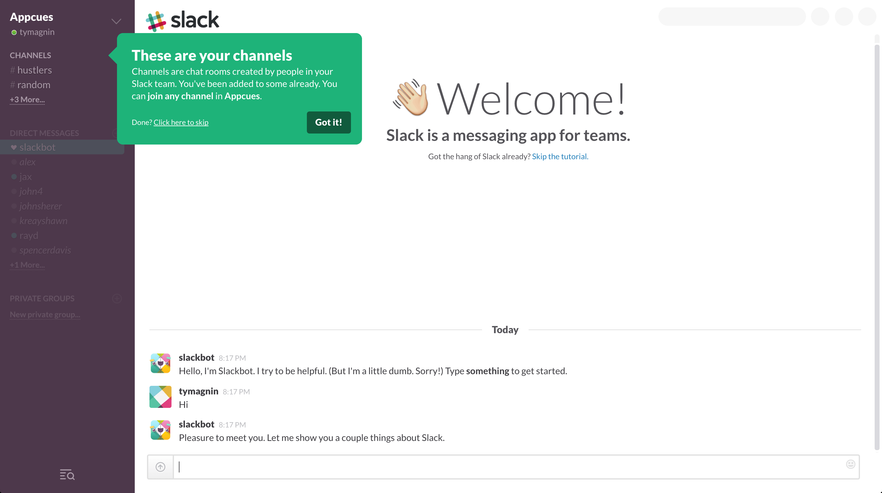
What they do: Slack's onboarding guides new users through creating their first workspace and channels in a conversational, step-by-step flow. Instead of showing an empty interface, they use Slackbot to simulate the messaging experience while teaching core concepts.
Why it works: This approach leverages the mere-exposure effect - by having users interact with the chat interface during onboarding, they become comfortable with it before they even realize they're learning. The conversational tone also reduces the intimidation factor of enterprise software.
Key metric: Slack has reported that users who complete their onboarding flow and invite at least one teammate have 93% higher retention at 30 days compared to those who don't.
How to apply this: Use your own product's interface as the onboarding medium. If you're building a messaging app, onboard through messages. If it's a design tool, onboard through a design project. This creates muscle memory from day one.
2. LinkedIn - Profile Completion Gamification
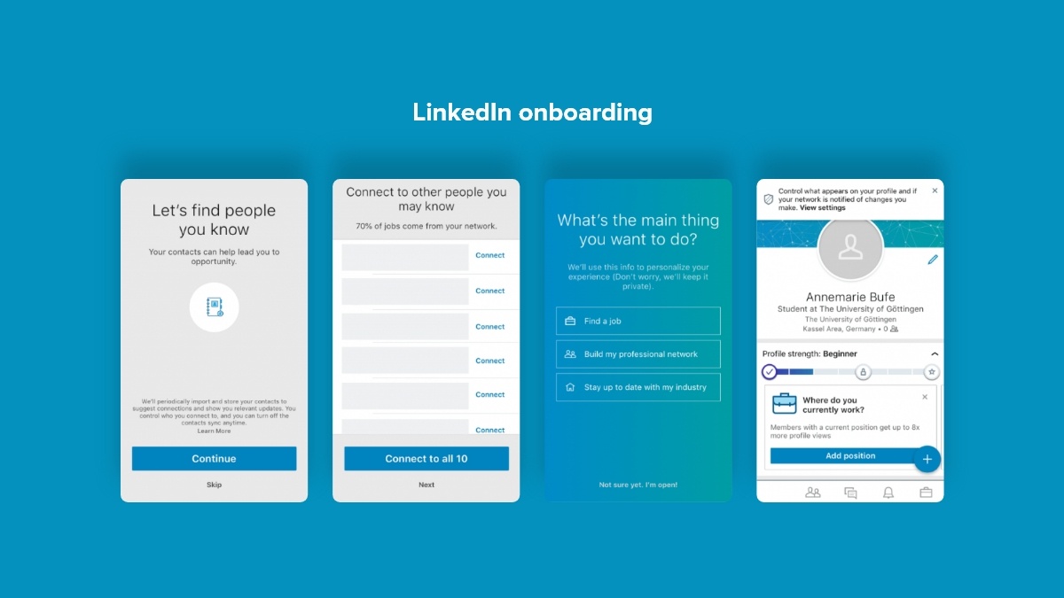
What they do: LinkedIn's onboarding centers around a profile strength meter that shows users exactly what percentage of their profile is complete and what steps will improve it. Each completed section unlocks new features and visibility.
Why it works: This taps into the Zeigarnik effect - our psychological need to complete unfinished tasks. An incomplete profile creates cognitive tension that users are motivated to resolve. The specific percentage also provides clear, achievable goals.
Key metric: LinkedIn users with complete profiles receive 40x more opportunities through the platform, creating a self-reinforcing loop where engaged users see more value.
How to apply this: If your product requires user-generated content or profile data, make completion progress visible and tie it to tangible benefits. Show users what they're missing out on by not completing setup.
3. Duolingo - Gamified Immediate Value
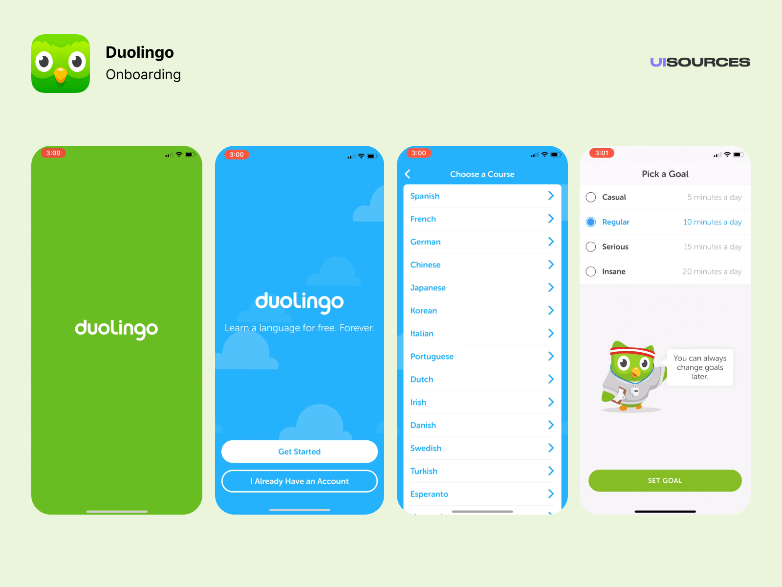
What they do: Duolingo lets users start their first language lesson before even creating an account. Within 60 seconds of opening the app, users are actively learning, earning points, and seeing their progress visualized.
Why it works: By delaying account creation until after users experience value, Duolingo reduces the friction that causes most apps to lose users at signup. The gamification elements (streaks, XP, leaderboards) create dopamine hits that drive habit formation.
Key metric: Duolingo's daily active users grew to over 31 million by 2025, with streak mechanics being cited as a primary retention driver - some users have maintained streaks for over 3,000 consecutive days.
How to apply this: Ask yourself: what's the minimum information you need from users before they can experience value? Delay everything else. Let them play with your product first, then capture their information when they're already invested.
4. Headspace - Emotionally Resonant First Experience
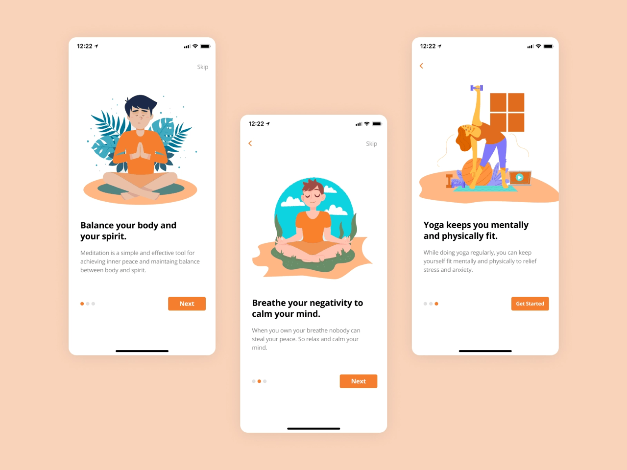
What they do: Headspace's onboarding immediately immerses users in a brief meditation session with calming visuals and guided audio. The first experience isn't about explaining features - it's about delivering the emotional benefit users came for.
Why it works: This approach creates an emotional anchor - users associate the app with the calm feeling they experienced in their first session. For wellness products, the onboarding must deliver on the emotional promise, not just explain functionality.
Key metric: Headspace has over 70 million downloads and reports that users who complete the introductory "Basics" course are significantly more likely to become paying subscribers.
How to apply this: Consider what emotional state your product promises. Design your onboarding to deliver a taste of that emotion immediately, even in a simplified form. Features can come later; feelings come first.
5. Dropbox - Single Action Focus
What they do: Dropbox's onboarding obsesses over getting users to complete one action: uploading their first file. Every element of the interface points toward this single goal, with minimal distractions or feature explanations.
Why it works: This leverages the foot-in-the-door technique - once users take a small action (uploading one file), they're psychologically committed and more likely to continue using the product. The simplicity also prevents decision paralysis.
Key metric: Dropbox grew to over 700 million registered users with this approach, demonstrating that extreme simplicity scales better than feature-rich onboarding.
How to apply this: Identify the single action that best represents your product's value. Design your entire onboarding around getting users to complete that one action. Everything else is a distraction.
6. Canva - Template-First Design
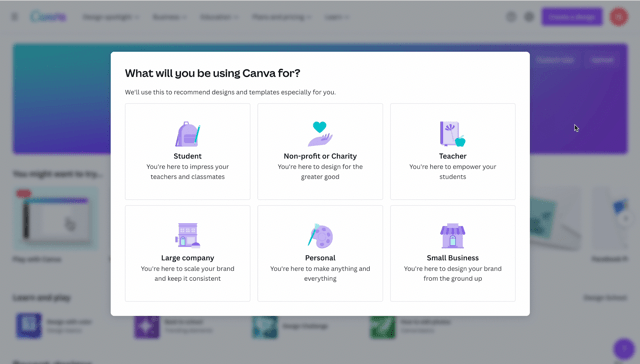
What they do: Canva asks users what they want to create (social media post, presentation, logo, etc.) and immediately presents relevant templates. Users start with a professional design and customize it, rather than facing a blank canvas.
Why it works: This addresses the blank page problem - the intimidation of starting from nothing. By giving users a head start, Canva reduces the skill barrier and lets users feel successful immediately. The personalization also ensures relevance.
Key metric: Canva has over 185 million monthly active users across 190 countries, with templates being the entry point for the vast majority of new designs.
How to apply this: If your product involves creation, provide starting points that are 70-80% complete. Let users feel like editors rather than creators. Success breeds confidence, which breeds continued use.
7. Grammarly - Instant Value Demonstration
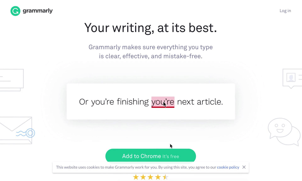
What they do: Grammarly's onboarding for their browser extension immediately shows the product working on sample text, with corrections appearing in real-time. Users see the value proposition demonstrated, not explained.
Why it works: "Show, don't tell" is the core principle here. By demonstrating the product's capability on familiar content types (emails, documents), users immediately understand how Grammarly will help them. There's no imagination required.
Key metric: Grammarly has over 30 million daily active users, with the browser extension's seamless onboarding cited as a key driver of organic growth.
How to apply this: Create a demo mode that shows your product working on realistic data. Let users see results before they invest in setup. The goal is to make the value undeniable before asking for commitment.
8. Spotify - Preference-Driven Personalization
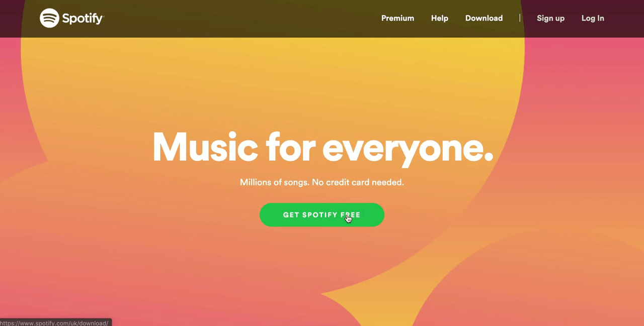
What they do: Spotify's onboarding asks users to select artists and genres they like, then immediately creates personalized playlists and recommendations. The product feels customized from the first moment.
Why it works: This creates psychological ownership - the Spotify experience feels like "theirs" because they helped create it. The personalization also ensures that the first content users encounter is relevant, increasing the likelihood of engagement.
Key metric: Spotify has over 600 million users, with personalized recommendations driving significant listening time and reducing churn among premium subscribers.
How to apply this: If your product can be personalized, ask the minimum questions needed to provide a customized experience. Make users feel like co-creators of their experience, not just consumers of a generic product.
User Onboarding Statistics (2026)
The importance of user onboarding continues to grow. Here are the key statistics that should inform your onboarding strategy:
- 86% of customers say they would stay more loyal to businesses that invest in onboarding content.
- 74% of potential customers will switch to a competitor if onboarding is too complex.
- 63% of customers consider onboarding when making a purchase decision.
- 82% of enterprise organizations consider customer onboarding a key driver of business value.
- 90% of SaaS companies use welcome screens, and 76% use micro surveys during onboarding.
- 64% of companies use in-app videos, while 47% offer interactive walkthroughs.
- 70% of customers will abandon digital onboarding if it takes more than 20 minutes.
- Users who complete onboarding are 2.6x more likely to remain active after 90 days.
User Onboarding Checklist
Use this checklist to evaluate and improve your own onboarding flow:
| Phase | Key Elements | Purpose | Success Metric |
|---|---|---|---|
| Welcome | Greeting, goal setting, expectations | Set context and reduce anxiety | Completion rate > 90% |
| Setup | Account config, preferences, integrations | Remove barriers to usage | Setup completion > 70% |
| First Action | Guided task, demo data, templates | Deliver immediate value | First action within 5 min |
| Checkpoint | Progress indicator, achievement, feedback | Build momentum and confidence | Return within 24 hours > 50% |
| Expansion | Feature discovery, advanced tutorials | Increase product stickiness | Feature adoption > 3 features |
How to Create Your Own Onboarding Flow
Based on the patterns above, here's a practical framework for designing your onboarding:
Step 1: Map the journey to first value. What is the single most important action that demonstrates your product's value? Work backward from that moment to identify the minimum steps required to get there.
Step 2: Identify and eliminate friction. Every field, every click, every decision is an opportunity for users to drop off. Question whether each element is truly necessary for the first session.
Step 3: Design progressive disclosure. List all your product's features, then categorize them: essential (needed immediately), secondary (useful in first week), advanced (power users only). Only show essential features during onboarding.
Step 4: Add personalization touchpoints. Identify 2-3 questions that would meaningfully change the user's experience. Ask these early and use the answers to customize the flow.
Step 5: Measure and iterate. Track completion rates at each step. Where do users drop off? Run A/B tests on specific steps. Small improvements compound - a 10% improvement at each of 5 steps yields a 61% overall improvement.
Tools for Creating Onboarding Documentation
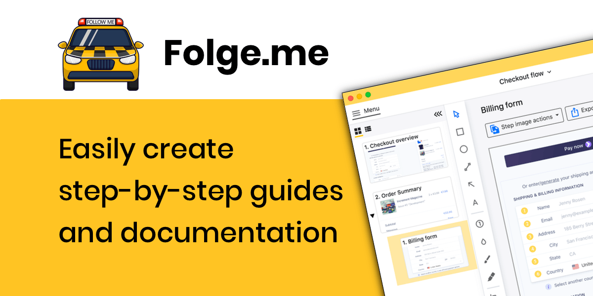
Creating effective onboarding often requires clear documentation and visual guides. Folge is designed specifically for this purpose - it lets you capture workflows in real-time, annotate screenshots, and generate professional onboarding guides in multiple formats (PDF, HTML, Word, PowerPoint).
Whether you're documenting your product's onboarding flow for internal teams or creating user-facing guides, Folge streamlines the process of turning complex procedures into clear, visual step-by-step instructions.
Frequently Asked Questions
How long should user onboarding take?
The ideal onboarding length depends on product complexity, but research shows that users start abandoning flows after 20 minutes. For most products, aim for a core onboarding of 2-5 minutes that gets users to their first value moment. Extended setup and advanced features can be introduced gradually over the first week.
What's the ideal number of onboarding steps?
Studies suggest 3-5 steps is optimal for the initial flow. Each step should represent meaningful progress. If you have more than 5 essential steps, consider whether some can be deferred or combined. Users should be able to see the end from the beginning.
Should onboarding be mandatory or skippable?
It depends on your product. For complex B2B tools, some mandatory guidance prevents user frustration. For consumer apps, making onboarding skippable (with an easy way to access it later) respects user autonomy. Track skip rates - if over 50% of users skip, your onboarding may be perceived as low-value.
How do I measure onboarding success?
Key metrics include: completion rate (% who finish onboarding), time to value (how long until first meaningful action), activation rate (% who complete key actions within 7 days), and retention correlation (do onboarded users retain better?). Compare cohorts who complete onboarding vs. those who don't.
What's the difference between B2B and B2C onboarding?
B2B onboarding typically involves multiple stakeholders, longer decision cycles, and more complex setup (integrations, permissions, data migration). B2C onboarding prioritizes speed and emotional engagement. B2B can tolerate longer flows if they're clearly adding value; B2C must deliver gratification immediately.
Related Resources
Explore more about user onboarding and documentation:
- SaaS User Onboarding: How To Drive Activation & Retention - Deep dive into SaaS-specific strategies
- Best User Onboarding Tools for Creating Sticky Users - Tool comparison and recommendations
- New Client Onboarding Checklist Template - Practical template for B2B onboarding
- Step-by-Step Guide for Creating a User Manual - How to document your onboarding
Conclusion
The best user onboarding examples share a common thread: they prioritize getting users to value as quickly as possible, with minimal friction and maximum relevance. Whether through gamification (Duolingo), emotional resonance (Headspace), or ruthless simplicity (Dropbox), successful onboarding is about understanding what users came for and delivering it before they lose interest.
As you design your own onboarding, remember that perfection isn't the goal - iteration is. Start with the simplest possible flow that delivers value, then refine based on data. The companies in this analysis didn't build perfect onboarding on day one; they built, measured, and improved relentlessly.
Ready to create better onboarding documentation? Download Folge for free and start capturing your product's workflows today.