Here's an uncomfortable truth for anyone who creates documentation: the vast majority of your users will never read it. Studies consistently show that users scan rather than read, with most visitors reading only about 20% of the text on any given page. For user manuals, the numbers are even more sobering—many users only consult documentation after they've already encountered a problem.
This creates a frustrating paradox for product teams. You invest significant time and resources creating comprehensive documentation, only to watch support tickets pile up with questions that are clearly answered in your carefully crafted guides. The result? Wasted effort, frustrated users, and overwhelmed support teams.
But here's the good news: users don't avoid manuals because they're lazy or incapable. They avoid them because most documentation fails to meet their actual needs. Understanding why users skip documentation is the first step toward creating resources they'll actually use. This guide explores the psychology behind manual avoidance and provides actionable strategies to create documentation that breaks through the noise.
The Psychology Behind Manual Avoidance
Before we can fix the problem, we need to understand the cognitive factors that drive users away from documentation. This isn't about user behavior being irrational—it's about our brains being highly efficient at conserving mental energy.
Cognitive Load Theory
Our working memory can only hold a limited amount of information at once—typically around 4-7 items. When documentation is dense, poorly structured, or filled with jargon, it quickly exceeds this cognitive capacity. Users experience mental fatigue and disengage before they find what they need. This is why a 50-page PDF manual feels overwhelming even if the answer to a user's question is on page 3.
The Paradox of Choice
Modern software products are feature-rich, which means their documentation tends to be extensive. When users face a massive knowledge base with hundreds of articles, the sheer volume can be paralyzing. Research by psychologist Barry Schwartz shows that too many options lead to decision paralysis and dissatisfaction. Users would rather guess or contact support than sift through an overwhelming documentation library.
Learned Helplessness
Many users have been burned by bad documentation in the past—guides that were outdated, inaccurate, or didn't address their specific problem. These negative experiences create a learned avoidance response. Users assume your documentation will be just as unhelpful as the last five they encountered, so they don't even try. Breaking through this barrier requires consistently delivering value every time a user engages with your docs.
Action-Oriented Mindset
Users typically come to your product with a specific goal in mind. They want to complete a task, not learn about your product comprehensively. Reading documentation feels like a detour from their primary objective. This is why just-in-time, contextual help outperforms comprehensive manuals—it meets users where they are, when they need it.
7 Reasons Users Skip Your Documentation
With the psychological foundation established, let's examine the specific reasons users avoid manuals—and what you can do about each one.
1. Information Overload
The most common documentation sin is trying to cover everything. When users encounter a wall of text with no clear hierarchy, they bounce. Every additional paragraph of context before the actual instructions increases the likelihood of abandonment. The fix: ruthlessly edit your content. Lead with the action, provide context afterward for those who want it, and use progressive disclosure to layer information.
2. Wrong Format for the Audience
A text-heavy manual might work for a reference-checking developer, but it fails completely for a visual learner trying to complete a task. Research indicates that visuals are processed 60,000 times faster than text, and instructions with illustrations are 323% more effective than text-only versions. If your documentation is purely text-based, you're excluding a significant portion of your audience.
3. Technical Jargon Barrier
Documentation written by experts often assumes knowledge that users don't have. Terms like "API endpoint," "webhook," or "environment variable" might be second nature to your team, but they're alienating to non-technical users. Every piece of jargon creates friction. The solution isn't to eliminate all technical terms—it's to know your audience and define terms when necessary.
4. Poor Discoverability
The best documentation in the world is useless if users can't find it. Common discoverability failures include: burying help links in footer menus, requiring users to leave the product to access docs, poor search functionality, and no clear categorization or navigation. Users will try 2-3 search queries at most before giving up and contacting support.
5. Outdated Content
Nothing destroys documentation credibility faster than outdated screenshots or instructions that don't match the current product. Once a user encounters stale documentation, they lose trust in the entire knowledge base. They'll assume other articles are equally unreliable—and they might be right. Documentation maintenance isn't glamorous, but it's essential.
6. Mobile-Unfriendly Design
A growing percentage of users access documentation on mobile devices, often while actively using your product on a desktop. Documentation that doesn't render well on mobile—tiny text, tables that require horizontal scrolling, images that don't resize—creates a frustrating experience that drives users away. Responsive design for documentation is no longer optional.
7. No Clear Path to Value
Users don't want to understand your product; they want to achieve their goals. Documentation that focuses on features rather than outcomes fails to connect with user motivations. Instead of "How to use the export function," try "How to share your work with your team." Frame documentation around user jobs-to-be-done, not product capabilities.
Documentation Formats Compared
Not all documentation formats are created equal. Understanding the strengths and limitations of each helps you choose the right approach for different use cases.
| Format | User Preference | Best For | Limitations |
|---|---|---|---|
| Text-Only Manuals | Low | Reference documentation, legal compliance | Hard to scan, high cognitive load |
| Video Tutorials | High | Learning complex workflows, onboarding | Can't search/skim, slow to update |
| Interactive Guides | Very High | Product onboarding, feature discovery | Complex to build and maintain |
| Contextual Tooltips | Very High | In-app guidance, field-level help | Limited depth, requires dev work |
| Screenshot Step-by-Step Guides | High | Task completion, troubleshooting | Requires updates when UI changes |
| Searchable Knowledge Base | Medium-High | Self-service support, comprehensive reference | Requires good search and organization |
The most effective documentation strategies combine multiple formats. Use contextual tooltips for in-app guidance, screenshot-based guides for task completion, and video for complex onboarding flows. Meet users where they are with the format that best suits their current need.
Modern Solutions That Actually Work
Understanding why users avoid documentation is only valuable if it leads to better solutions. Here are proven approaches that increase documentation engagement and reduce support burden.
Microlearning
Break documentation into bite-sized, task-focused pieces. Instead of a 20-page user guide, create focused articles that answer a single question or help users complete a single task. Users can consume what they need without wading through irrelevant information. Each piece should be completable in under 3 minutes.
Just-in-Time Documentation
Deliver help at the moment of need, not in a separate documentation portal. This could mean tooltips that appear when users hover over complex features, contextual help links next to form fields, or smart suggestions when users appear stuck. The goal is zero-click access to relevant information.
Visual Step-by-Step Guides
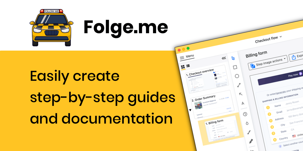
Screenshots dramatically improve comprehension and task completion rates. A tool like Folge makes it easy to create visual guides by automatically capturing screenshots as you perform a task, then annotating them with arrows, highlights, and explanations. This approach shows users exactly what they'll see and where to click—eliminating ambiguity.
Searchable, Well-Organized Knowledge Bases
When users do seek out documentation, they need to find answers fast. Invest in robust search functionality with typo tolerance and synonym matching. Organize content logically with clear categories and use consistent naming conventions. Surface popular articles and related content to help users discover relevant information.
Video + Text Hybrid
Combine the engagement of video with the scannability of text. Embed short video clips demonstrating key steps within written guides. This caters to visual learners while still allowing text-preference users to quickly scan and find what they need. Always provide text alternatives for accessibility.
How to Create Documentation Users Will Actually Read
Putting these principles into practice requires a shift in how you approach documentation creation. Here's a practical framework:
Start With the User's Goal
Before writing anything, ask: "What is the user trying to accomplish?" Frame your documentation around outcomes, not features. The title "How to get your team started with shared projects" is more compelling than "Project sharing settings overview."
Use Progressive Disclosure
Layer information so users can go as deep as they need. Start with the quick answer or essential steps, then offer expandable sections for additional context, edge cases, or advanced options. This respects both the user in a hurry and the one who wants comprehensive understanding.
Add Screenshots for Every Action
When documenting software tasks, screenshot every step. This eliminates ambiguity and builds user confidence. Tools like Folge automate this process by capturing screens as you perform the task, dramatically reducing the time required to create visual documentation.
Test With Real Users
Documentation that makes sense to the author may confuse users. Test your guides with people unfamiliar with your product. Watch where they get stuck, what questions they ask, and what they skip. This feedback is invaluable for identifying gaps and unclear instructions.
Keep It Updated or Remove It
Outdated documentation is worse than no documentation—it actively misleads users and damages trust. Build documentation maintenance into your product release process. When features change, documentation updates should be part of the definition of done. If you can't maintain a piece of documentation, archive it rather than leaving stale content live.
Frequently Asked Questions
What's the ideal length for a user manual or guide?
There's no universal ideal length—it depends on the complexity of the task. However, research suggests that documentation should be as short as possible while still being complete. For task-based guides, aim for completion in under 3 minutes. For comprehensive reference documentation, focus on excellent organization and search rather than reducing length. Users are more tolerant of length when navigation is excellent.
Should I use video or written documentation?
Both have their place. Video excels for demonstrating complex workflows, onboarding, and building emotional connection. Written documentation is better for quick reference, searchability, and accessibility. The best approach is often hybrid: embed short video clips within written guides so users can choose their preferred format. Always provide text alternatives for video content.
How often should documentation be updated?
Documentation should be reviewed whenever the product changes—ideally as part of the feature release process. Beyond reactive updates, schedule quarterly audits to catch drift, update screenshots, and refresh content based on support ticket trends. Set up alerts for high-traffic documentation pages that haven't been updated in 6+ months.
What's the best format for mobile users?
For mobile users, prioritize: short paragraphs (2-3 sentences max), collapsible sections for progressive disclosure, images that scale responsively, tap-friendly navigation, and offline accessibility where possible. Avoid tables that require horizontal scrolling and ensure text is readable without zooming. Test your documentation on actual mobile devices.
How do I measure documentation effectiveness?
Track metrics including: search queries (especially failed searches), time on page, bounce rate, support ticket deflection rate, user feedback ratings, and task completion rates for guided flows. Correlate documentation usage with support tickets—if the same questions keep appearing despite documentation existing, there's a discoverability or quality problem.
Related Resources
Learn more about creating effective documentation that users will actually read:
- Step-by-Step Guide for Creating a User Manual — comprehensive guide to writing effective manuals
- Why Screenshots Make Guides More Effective — the power of visual documentation
- 7 Best Practices for Clear Software Documentation — practical tips for better docs
- Using Documentation Software to Create Effective Manuals — tool recommendations
Final Thoughts
Users don't avoid manuals because they're lazy or incapable. They avoid them because most documentation fails to respect their time, match their learning preferences, or meet them at their moment of need. By understanding the psychology behind documentation avoidance and applying modern solutions—microlearning, visual guides, just-in-time help, and excellent organization—you can create resources that users actually engage with.
The shift requires thinking like a user, not a product expert. It means prioritizing scannable, visual content over comprehensive text dumps. It means investing in maintenance as seriously as creation. Most importantly, it means accepting that the goal isn't to document everything—it's to help users succeed at their tasks as quickly as possible.
Ready to create documentation users will actually use? Folge makes it easy to build visual, step-by-step guides that show users exactly what to do. Capture screenshots automatically, add annotations, and export to PDF, HTML, Word, or other formats—all in minutes. Download Folge for free and start creating documentation that breaks through the noise.