They say, "A picture is worth a thousand words," and this is true with user guides/manuals as well. Whether it is software or a tangible product user manual, visuals play a vital role in making the guide more concise and much easier to scan for your target audience. You can choose to use still photos, screenshots, GIFs, or even videos depending on the type of guide you are creating and the target audience.
For instance, while creating a step-by-step guide for a software product, using screenshots is inevitable if you want your users to get the best value from it. In today's article, I will discuss why it is important to use screenshots and visuals in general while creating a step-by-step guide for your next product. We shall also look at some other types of visuals that you can use in your guides and the best use case for each.
Let’s dive in!
The Value of Visual Instructions
Depending on the type of user guide you are creating, you may choose to include visual instructions along with text or no text at all. Blending text and visuals in your guide gives it more clarity and also makes it easier for your target readers to follow and understand. However, the amount of text and visuals you use should vary depending on the intended use of the instructions.
The main objective for adding visual instructions is to clarify concepts that are usually harder to explain using words. With visuals, it is easier to show how something looks, how something should look after completing specific steps, how something is done or constructed, show trends or relationships, and help organize the information you are trying to present to your readers.
Use cases for different visual formats
While creating your user guide, choosing the suitable visual format will significantly affect the effectiveness of your guide. Let's look at some of the common types of visuals you can use in your guides and when to use them.
- Still images – Using still images is more appropriate while creating a guide for something visual and tangible, for example, an animal or a product like a car. You can choose to use either stock photos from the internet or images you have taken with your camera.
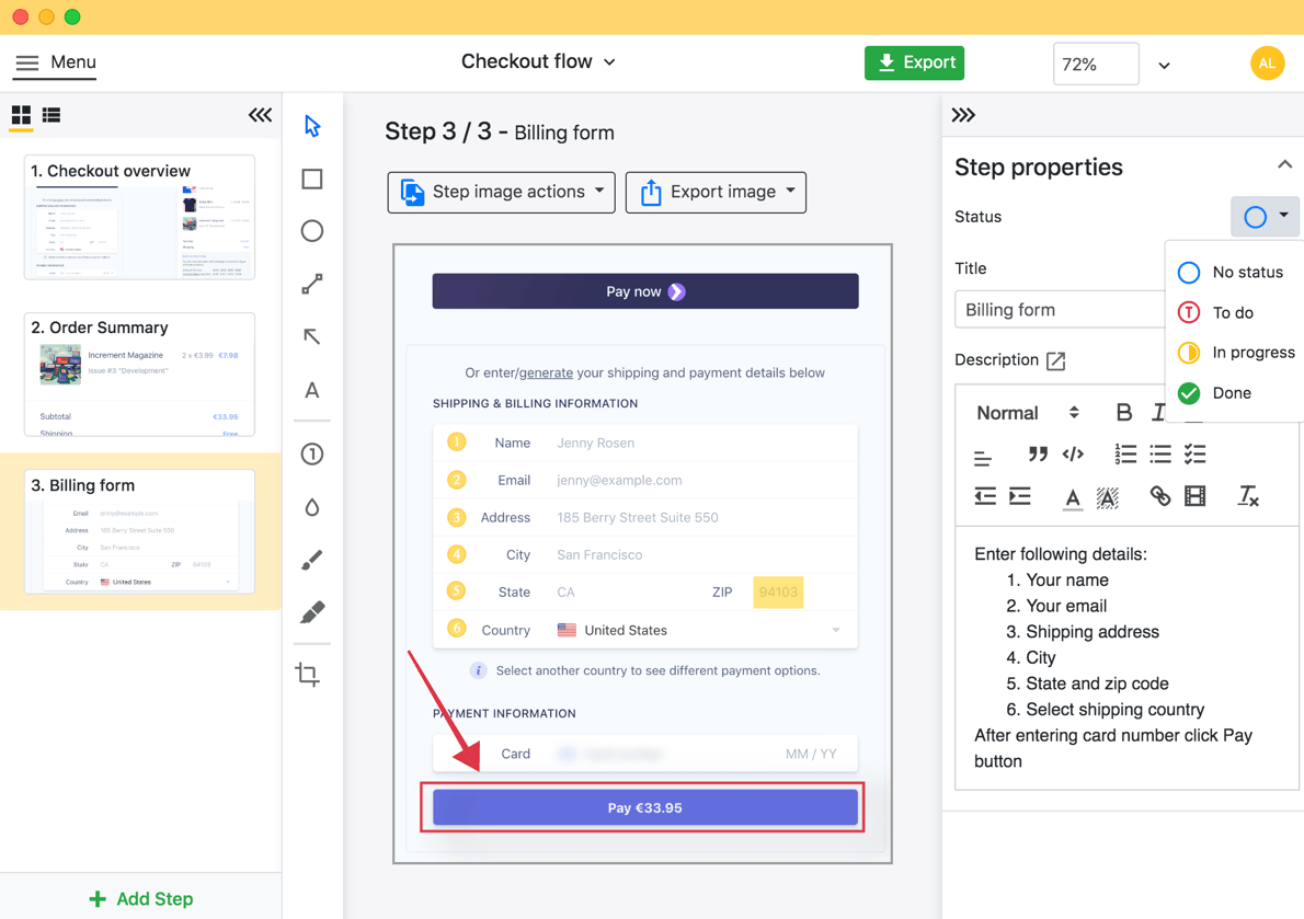
- Screenshots – These are best for guides about software-based products. For instance, if you are creating a guide about how to use software like MS Word, it will make sense to use screenshots while explaining some of the sections in your guide. Creating guides with screenshots is very quick and easy, thanks to tools like Folge that reduce the number of sections you have to add manually.
- GIF – Graphical Interchange Format or GIFs work best while explaining short processes (under 8 secs), which are harder to bring out with plain text.
- Chart – There are several types of charts, including bar charts, pie charts, and line charts, that you can use to give more context to your text. Charts are the best type of visuals while comparing a set of numbers or statistics. For instance, if you are comparing the market share of different companies in a given market, using a pie chart would make this comparison easier to visualize for your readers.
- Video – One of the most popular ways of creating long-form explainer guiders is through videos. Creating a great technical video requires creativity, having a good camera, and editing tools like Folge.
It is also fine to use more than one of the visual formats we have discussed above; it all depends on the type of guide you are creating and what you think will make it easier for your target audience to understand. For today, our focus will mainly be on screenshot-based guides.
Screenshot-based guides
Pros of screenshot-based guides.
1. Easy and time-saving
Modern Operating Systems like Windows and macOS have made creating screenshots quick and easy, which is really time-saving. Using screenshots also makes it easier to make changes to your guide later when the need arises. For those who want to save even more time, using software tools like Folge will make the process of creating your screenshot-based guide much faster.
2. They make documents more organized
A guide that includes screenshots will usually look way more organized than one with just plain texts. An organized document makes it easy for the reader to follow and find solutions for whatever challenges they might be having with using or setting up your product. Remember, your goal is to ensure readers find whatever they are looking for as fast as possible.
3. 3. Screenshots can be reused
The beauty of screenshots is that you can always reuse them in your future documents as long as they are relevant for that document. For instance, if you are creating a user guide for specific software, you can still reuse some of the screenshots while creating a guide for an updated version of that software.
Cons of screenshot-based guides.
There are not so many disadvantages of adding screenshots to user guides. However, there is one worth sharing with you; screenshots can sometimes be boring when not implemented appropriately. It is also important to use them in the right proportions; don't pile a single user guide document with too many of them.
How visual instructions add value to your user guide
1. Most users find it hard to read text-only instructions
As we have earlier shared, the main objective of your user guide is to help readers solve a challenge they might face while setting or using your product. Adding too many unnecessary paragraphs will only make this process worse for them. Most people want to scan through the guide within a few minutes and be able to find the solution to the challenge they are facing.
Remember, if a customer doesn't find your guide easy to understand, they will likely not be able to use your product appropriately.
2. Most people pay more attention to graphics than text!
While reading any piece of content, several people usually pay more attention to the images before they even look at the text. So, it is important to add images (in form of screenshots) that give your users more clarity about what you are trying to explain in your user guide. It may sound strange, but your target uses will likely spend more time staring at your screenshots than the text.
For best results, it is always best to spend more time creating screenshots that capture valuable content and then compliment them with a few lines of relevant text. The text should just briefly explain what is in the screenshot for users who may not be able to clearly interpret the screenshot. However, you may choose not to add texts for self-explanatory screenshots.
3. Screenshot-based guides are quick to generate with software
Choosing the right tools while creating screenshot-based guides will significantly enhance your productivity and also add more value to the final document you create. One of the tools you can use to create user manuals with visuals is Folge. It is easy to use, thanks to its simplified and intuitive UI. So, you don't have to do all the work manually; Folge will take some of this burden off your back.
4. They make complex processes easier to explain
Using screenshots saves you the burden of writing several lines of text because only one screenshot can summarize several steps. Screenshots also add more clarity to the guide since the user can clearly see what they have to do or the exact icon they have to click while fixing a particular problem.
5. They make the user guide more professional and worth trusting
The first impression you create with your user guide will significantly affect how customers look at your product the guide is addressing and your business in general. When your guide includes all the necessary steps with precise descriptions and relevant screenshots, it will make most people think that you spent a lot of time while creating the manual, which makes them feel valued.
On the other hand, if your user guide document is not written with clarity, users will end up overwhelming your support team with calls and messages. Some may actually consider not using your product, especially if the product is hard to use without a guide. In the worst-case scenario, some users can also write a negative review about your product just because the guide was not good enough.
So, while creating a user guide, you need to have your customers at the back of your mind so that you create something they can easily trust and relate to. There is no other way to create a user guide that your users can trust and easily connect with without adding relevant visuals.

Add screenshots using
Folge, annotate them and export in many formats.
Shortcomings with visual instructions
Yes, visual instructions have significant benefits that make them the ideal format for most users. However, they also have shortcomings that you need to address to enhance the effectiveness of the guide. For instance, using unclear graphics will only confuse the user even more. That is why it is crucial to choose the screenshots and any other graphics you add to your guide wisely.
Some screenshots (especially those with several contents) can be eye-straining for some users, which might force them to constantly zoom in while reading the guide. This affects the reading experience, especially for users using devices with small screens to read the guides. In this case, it is best to spit up the screenshot to ensure it is very clear to the user no matter the device they are using to read your guide.
Graphics that are too specific for particular fields are also harder to understand by the general public. If you are creating a guide for a broad audience that includes both technical and non-technical readers, make sure you use visuals that do not require any prior knowledge about the product to understand them.
Before you publish the user guide document, you may also sample a few people in your target audience to find out whether they understand all the content in your guide without having to ask you questions.
Most of the time, you will create this document using a Word Processing application like MS Word. However, it is always best to share this document in a format that is easy to read on various devices. The best formats you can use for your guide include PDF, Word, and maybe PowerPoint. These are already provided by Folge, as well as the following:
Benefits of using visual-rich instructions in other areas.
I will split these benefits into two; those for marketing and those for education.
Marketing and advertising.
In marketing, using visual instructions is essential, especially if you targeting users that speak different languages. Visual instructions are also much easier to understand for customers in different age groups, gender, and levels of education. So, for any business targeting users in different demographics, visual instructions are the way to go.
Visual instructions are easy to understand, which reduces the number of returns and also eases the pressure on your customer support team. If your product is not as intuitive, having visual instructions will significantly reduce the number of calls/messages your support team has to deal with. This, in the end, enhances customer satisfaction.
Education
When it comes to education and academia, visual instructions make it easier for the readers to understand complicated subjects. With visuals, it is much easier to connect prior knowledge about the subjects with new concepts. It is also much easier for students to clarify thoughts, organize and analyze information, integrate new knowledge, and think critically when a concept is presented visually.
Visual instructions also provide structure for thinking, writing, discussing, analyzing, planning, and reporting. This, in the end, enhances the rate of learning and productivity of the learners.
Related Resources
Explore more about creating effective visual documentation:
Easily create top notch technical documentation and guides
🏆 Try and use Folge for free forever.
Download now