A user manual is the document people reach for the moment they get stuck: setting up a device, finding a setting, or figuring out why something isn't working. A good one answers the question fast. A bad one sends the reader to your support inbox instead.
To write a user manual: define who it's for, structure it into the ten sections readers expect (intro, getting started, interface overview, core tasks, settings, troubleshooting, FAQ, glossary, support, revision history), write every task as numbered steps with a screenshot per step, then publish it as PDF and HTML and keep it updated. Skip the blank page entirely and start from our free user manual template, which already has this structure filled in with placeholders. This guide walks through how to fill it in well.
Who a user manual is for
Before writing a single sentence, decide who's reading. A user manual for a consumer gadget is read by someone who just unboxed it and wants it working in the next five minutes; the language needs to be simple, and the very first section needs to be setup. A user manual for internal software is read by an employee who was told "check the manual" by a colleague; they're often more technical, but they're also impatient, because they were expecting to just ask someone.
Write down, in one sentence, who your reader is and what they're trying to accomplish when they open the manual. That sentence should shape every decision that follows: how much background to explain, how formal the tone is, and which sections matter most. A manual for a welding tool and a manual for a SaaS dashboard should not read the same way, even if they follow the same structure.

The 10 sections a user manual needs
Most user manuals, whether for software or hardware, share the same skeleton. Our free user manual template is built around these ten sections, ready to copy or download as PDF or Word:
- Introduction: what the manual covers, who it's for, and any conventions used (bold for buttons, monospace for values you type, and so on).
- Getting started: system requirements, installation steps, and what to do on first launch.
- Overview of the interface: an annotated screenshot of the main screen with each element labeled.
- Core tasks: the handful of things most users actually need to do, each written as its own numbered section.
- Settings and customization: where the important options live and what they control.
- Troubleshooting: a table of symptom, likely cause, and fix, so readers can scan instead of read.
- FAQ: the questions that don't fit neatly into a task, like billing or licensing.
- Glossary: definitions for any product-specific or technical terms.
- Support and contact: how to reach a human when the manual doesn't solve it.
- Revision history: a table tracking version, date, author, and what changed.
Not every product needs all ten. A simple internal tool might not need a Glossary, and a manual for a single-purpose device might not need Settings. Keep the sections that earn their place and cut the rest.
How to write a task-based section
The Core Tasks section is where most manuals succeed or fail, because it's the part people are actually searching for when they open the document. Write each task as its own self-contained section with a clear title, e.g. "Export a report" or "Reset your password," not a paragraph buried inside a longer chapter.
Inside each task, use numbered steps rather than prose. Each step should describe one action: click one button, type one value, choose one option. If a single step requires the reader to make three decisions at once, split it into three steps. End every task with an "Expected result" line that tells the reader what they should see if it worked, so they know when to stop and when to troubleshoot.
Avoid writing steps the way you'd narrate a feature to a colleague. "Configure your notification preferences as needed" isn't a step, it's a shrug. "Click Settings, then Notifications, then toggle Email Alerts on" is a step someone can actually follow without guessing.
Screenshot and annotation guidance
Every step that involves clicking, typing, or navigating a screen should have a screenshot next to it. Text-only instructions force the reader to hold a mental model of an interface they've never seen; a screenshot removes that burden entirely. This is the single biggest difference between a manual people actually use and one they abandon halfway through.
A plain screenshot isn't enough on its own, though. Annotate it: an arrow pointing at the button to click, a highlight box around the field to fill in, a number matching the step it illustrates. Consistent annotation style across the whole manual (same arrow color, same highlight style) makes the document feel finished rather than thrown together.
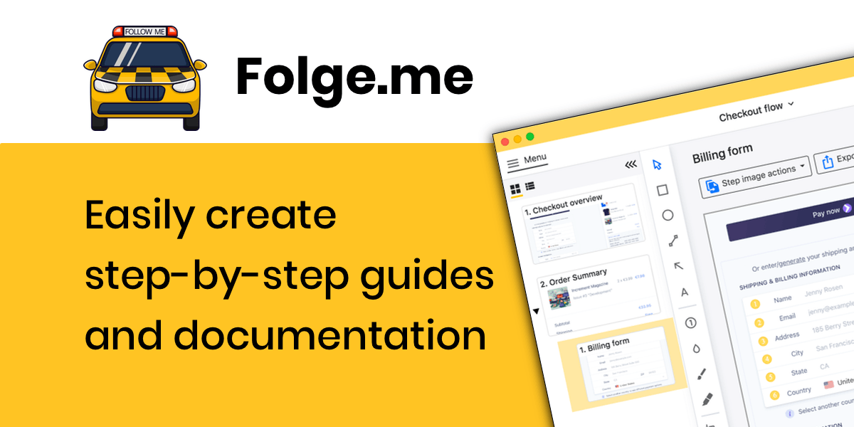
This is also where manuals get slow to produce, because capturing, cropping and annotating dozens of screenshots by hand eats hours. Folge is a Windows and macOS desktop app that takes a screenshot automatically on every click as you walk through the product once, then gives you 20+ annotation tools (arrows, highlights, blur, numbering) plus OCR to make text in screenshots searchable. If a screenshot contains something sensitive, like a real customer name or an internal URL, run it through our free blur tool first, entirely in your browser, nothing uploaded.
Already have a screen recording of the workflow instead of live access to click through it yourself? Our free video to steps tool turns a recording into a numbered, screenshotted draft you can clean up and drop into the manual.

Tone and formatting rules
Write in the second person and the imperative mood: "Click Save," not "The user should click Save" or "You will want to click Save." It's shorter and it's how instructions are meant to read. Keep sentences short. If a sentence needs a comma to explain a condition, consider whether it should be two steps instead of one sentence.
Use consistent formatting for the same kind of thing every time: bold for anything the reader clicks or types into, monospace for exact values, a warning icon or bold red text for anything destructive or irreversible. Readers scan manuals, they don't read them top to bottom, so visual consistency is what lets them scan effectively.
Add a table of contents at the top once the document is more than a couple of pages, and make sure the headings are real headings (not just bold text) so the table of contents, PDF bookmarks, and any search functionality all work correctly.
Keeping it updated
A manual with outdated screenshots is often worse than no manual, because it actively misleads the reader into clicking a button that's no longer there. Note the product version the manual applies to on the cover, and keep a revision history table so anyone can see at a glance whether it's current.
Treat manual updates as part of shipping a change, not an afterthought. When a UI changes, the person who changed it (or whoever owns documentation) should update the relevant screenshots and steps before, or immediately after, release. Publishing to HTML rather than only PDF makes this easier, since an HTML version can be updated in place without redistributing a new file to everyone who downloaded it.
Common mistakes
- Writing features instead of tasks. A list of what the product does isn't the same as instructions for how to do something with it.
- No screenshots, or screenshots without annotation. Both leave the reader guessing.
- Steps that bundle multiple actions. One step, one action; otherwise readers lose their place.
- No troubleshooting section. Every product breaks sometimes; a symptom/cause/fix table cuts support volume.
- Letting it go stale. An unmaintained manual erodes trust faster than having no manual at all.
- Burying the table of contents or skipping headings. Readers need to jump straight to their task, not scroll through everything.
Frequently Asked Questions
What's the difference between a user manual and an SOP?
A user manual explains how to use a product, aimed at an end user or customer. An SOP (standard operating procedure) documents an internal process a team follows, like onboarding an employee or resetting a password. If you need the latter, see our free SOP templates.
How long should a user manual be?
As long as it takes to cover setup and every core task, and no longer. Length should follow the number of tasks the product requires, not a fixed page count; a simple tool might need two pages, a complex platform might need fifty.
What's the fastest way to create a user manual?
Start from a template instead of a blank page (our free user manual template has all ten sections already structured), then use a screen capture tool to generate the screenshots instead of taking and cropping them by hand. Folge is free for up to 5 guides, then $89 one-time for unlimited use, and exports to PDF, Word, PowerPoint, HTML, Markdown, JSON, SCORM and GIF.
What format should I publish a user manual in?
PDF for downloads and printing, HTML for a help center or knowledge base since it's searchable and easy to keep current, and Word when other people need to edit it. Publishing the same manual as both PDF and HTML covers most audiences.
Related Resources
Continue learning about effective documentation:
- Free User Manual Template: copy, download as PDF or Word, or fill in online
- Why Users Don't Read Manuals: understand your audience better
- Why Screenshots Make Guides Effective: visual documentation tips
- Step-by-Step Instruction Template: get started faster with templates