# Annotations & Shapes
Folge provides a set of annotation tools to highlight, explain, and draw attention to specific areas of your screenshots. You can access these tools from the toolbar above the step image in the editor.
# Available tools
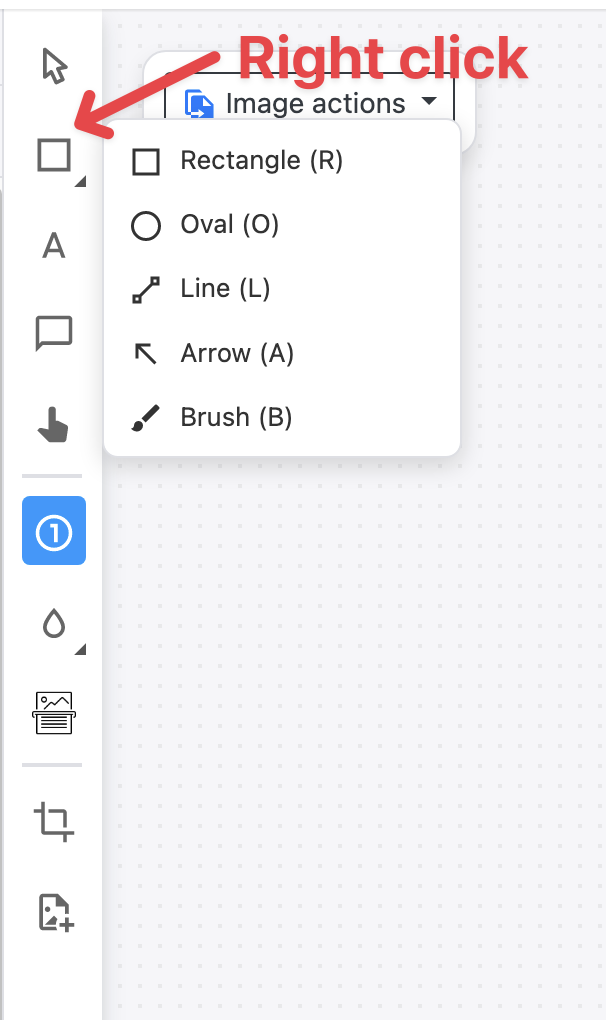
# Shapes (grouped)
| Tool | Description |
|---|---|
| Rectangle | A shape overlay to highlight or frame a region |
| Oval | An elliptical shape for circling or highlighting areas |
| Line | A straight line to connect or underline elements |
| Arrow | A directional arrow to point at or connect elements (straight or curved) |
| Brush | Freehand drawing on the screenshot |
TIP
Arrows can be straight or curved — switch between them in the Object Properties panel using the Arrow curve option. In curved mode, a small handle appears on the middle of the arrow; drag it to shape the curve.
# Text & Callouts
| Tool | Description |
|---|---|
| Text | A standalone text label placed directly on the image |
| Tooltip | A text callout with a pointer tail, ideal for labeling UI elements |
| Cursor | A cursor icon overlay to indicate where to click |
| Step Numbers | Auto-incrementing numbered circles to show a sequence of actions |
TIP
The Text tool supports an optional outline border — enable it in the Object Properties panel to add a colored border around the text box, making it stand out against busy backgrounds.
# Effects (grouped)
| Tool | Description |
|---|---|
| Blur | Blurs out sensitive or irrelevant areas of the screenshot |
| Highlight | A semi-transparent marker overlay to draw attention to text or areas |
| Magnifying Glass | Zooms into a region of the screenshot for detail |
| Spotlight | Dims the entire image except for a selected area, drawing focus |
# Other
| Tool | Description |
|---|---|
| OCR | Extracts text from the screenshot image |
| Crop | Crops the step image to a selected region |
| Add Asset | Inserts an external image (logo, icon, etc.) onto the screenshot |
# Adding annotations
Select a tool from the toolbar, then click and drag on the step image to create the annotation. Once placed, the annotation can be moved, resized, and customized using the Object Properties panel on the right.
# Object Properties
When an annotation is selected, the Object Properties panel appears on the right side of the editor. Here you can customize the appearance of the selected annotation — fill color, border, font settings, corner radius, and more.
# Tooltip tail
Tooltips have a pointer tail that connects the callout to the element it describes. You can customize the tail's appearance in the Object Properties panel:
- Tail style — choose between different tail shapes
- Tail color — set a custom color for the tail (defaults to the tooltip's fill color)
- Tail width — control the thickness of the tail
# Applying styles across steps
When you have multiple annotations of the same type across different steps, you can apply style changes in bulk. See Apply styles across steps for details.